Measuring the Success
In 25 words or less: measuring the success is all about critical analysis of the data you have available.
The key word here is critical. There is almost no performance indicator which we are going to look at that is not open to at least two different interpretations. The take home message is to think and review critically.
Objectives
Most government websites have at least two common objectives - better service and saving time and money.
Better service is strongly linked to increased useability and increased accessibility. It is through useability and accessibility that you can achieve better service.
Accessibility and Useability
Useability and accessibility are all about presentation, structure and content.
Presentation - the sites look and feel. The key message here is that it should enhance the delivery of information and not detract from it
Structure - the relationship between areas of content. The key aim is always the shortest path for users between related information. Information may be related because it is on the same topic, like further information or because it is the next part of a process that the user is involved in.
Content - has the greatest impact on useability and accessibility and also takes the most effort to get right. The best content management system in the world is useless if filled with the wrong information. Getting the right information is the key.
Content is also the hardest area in which to measure performance because it is the most subjective item from a user perspective. Most of the time analysis of content performance is based on anecdotal evidence and extrapolation from other data sources.
Key Performance Indicators
The number of key performance indicators you may have for your website is limited only by your imagination. There are, however, three good starting points.
Usage is certainly a good indicator of performance, particularly a lack of usage.
The time required to complete a process for transactional website is also very important. Comparison should always be made with alternate processes available. This is what users will be doing when they try the process. Is it quicker than going to a government shopfront? Is it quicker than writing a cheque and mailing a letter? Is is quicker than using a phone based process?
User expectations - the ability to meet user expectations is also an important performance indicator. However, a large part of meeting user expectations is managing those expectations in the first place. If properly managed you can be the one creating the user expectation that you can then fulfill or exceed.
Sources of information
There are four sources of information that are invaluable when measuring website performance: server logs, usage testing, user surveys and clever structural design. We will touch on the first and last of these.
Server logs
Server logs are the most common source of web usage information. A log will typically contain information on the page requested, the users IP address, the web browser they used and possibly the operating system along with the time and date. Each time a user loads a page on their web browser the server will create an entry in the server log.
High usage websites will have server logs that are millions of lines long and require continuous archiving to avoid huge files. Make sure that you keep these archived logs. They are an invaluable source of information over time and cannot be reconstructed if deleted.
are the most common source of web usage information.
A log will typically contain information on the page requested, the users IP address, the web browser they used and possibly the operating system along with the time and date.
Each time a user loads a page on their web browser the server will create an entry in the server log.
High usage websites will have server logs that are millions of lines long and require continuous archiving to avoid huge files. Make sure that you keep these archived logs. They are an invaluable source of information over time and cannot be reconstructed if deleted.
When analysing logs it is important to correlate that information with external events and occurrences. These can be regular in nature, like weekends or public holidays or they can be one-offs occurrences like the start of an advertising campaign or natural disasters like the Canberra bushfires.
You can also compare between comparable sets of data. For example, compare this year with last year or compare usage on weekends with usage during the week. All of these comparisons can give you hints about performance and user profile.
The graph shows the number of pages viewed per day on the allhomes.com.au website since its launch.
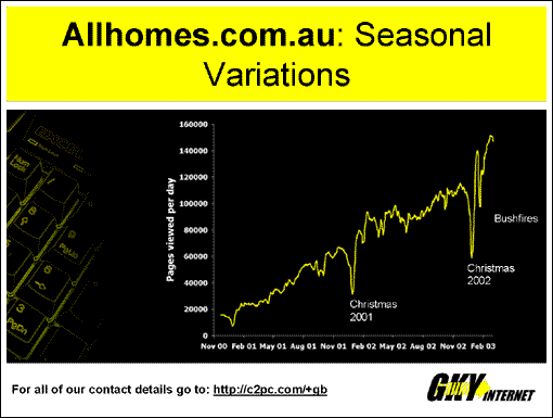
Allhomes.com.au is the Canberra regions premier real estate website. About 95% of real estate agencies in Canberra and surrounds participate and each week there are about 2500-3000 properties advertised for sale. Agents are responsible for updating all of their listing information and our content management system has about 1000 content contributors.
You can see that the site has been experiencing steady growth since launch. However, there are also two really significant drops in usage. At first glance, these drops are so defined that they should be reason for panic, but when you correlate them with the holiday season and compare 2001 with 2002, you see that they are a repeating seasonal variation in usage
You can also see that after the Christmas period there is a second dip in mid to late January. This is particularly pronounced in January 2003.
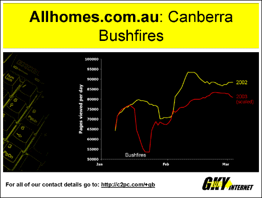
The accentuation of the dip we see in January 2003 is due, of course, to the Canberra bushfires. If we analyse that part of the graph in more detail and overlay an appropriately scaled view of the 2003 data compared to 2002 data we see that this drop in usage is indeed due to the fires.
We have reached this conclusion because the drop correlates with the date of the fires but more importantly the overall trend through January to March is very similar from 2002 to 2003 except for this one event.
Server log caveats
Caches and proxies
Web and proxy caches play havoc with the accuracy of web log entries. 500 users in an organisation may look at a web page through their departmental cache but only the first page load will appear in the log. Subsequent hits are sent straight from the cache and not the source website.
Accordingly, in this modern time of firewalls, caches and large LANs your server logs will always be registering less hits than what are actually occurring.
Don't analyse in isolation
Take care not to over analyse the log information and certainly never analyse the information in isolation. A good example of this audience size. Each type of information has a different sized audience. When comparing the success of one part of a website with another some scaling should be attempted based on the relative size of the target audience.
Accordingly, relatively low hits may still mean that you are getting a large percentage of your target audience where the size of that audience is small.
Clever structural design
Good structural design is critical to producing a useable website. However, it is also a critical part in gathering information on usage and performance.
What we need to remember is that for the most part the only information we can gather is when a page is loaded and when a form is submitted to the server for processing.
Accordingly, if you embody a lengthy process in a single web page then your server log will only show you when the page was loaded, whether it was submitted or not and how long it took to submit.
However, if you take that lengthy process and divide it into steps that are significant from a hit logging point of view you will gather much better data on how users are negotiating your online process. Principally, you will gather data on how long users are taking between steps and where users are abandoning the process
Process failure
Splitting processes into key steps gives us a great way to analyse process failure and for our purposes data on process failure is more important than data on process success.
Failures are critical to the refinement of any process. Where users abandon a process is vitally important feedback that allows us to perform additional analyses around those failure points.
Search forms - a special mention
This is also the case with search forms. It is important to keep a record of those searches that produce no results. Why does everyone from the United States search my website for "ketchup" and find nothing when I have hundreds of varieties of tomato sauce. If you were not logging the failed search words you would not know this valuable information.
Distinguishing between users
There are three ways we can try to distinguish between users and thereby analyse performance at the individual user level:
- Unique log-ins are a good way but they are limited in their application because they require that everyone be given a unique username and password and use this when interacting with the website.
- Session-ids that are uniquely generated each time a process is begun are universally applicable, but because they are dynamically created require programming and database work to implement.
- Cookies are also good but they track browsers and computers rather than users. Most web servers can be configured to issue a unique cookie each time a browser loads a page from a site the first time. However, if a person views the same site from two different computers or if multiple people use the same computer, cookie based analysis will be inaccurate.
Simulating the individual
Because it is so difficult to identify users we are often left with having to simulate the individual from the aggregated data. This is all about taking large amounts of data and averaging it across our process.
The key here is to look for are patterns that may give us insight into our websites operation or performance. However, sometimes there just isnt any particular average user. We cant find a pattern or a stereotypical user.
For example, the allhomes website has many user types including buyers, sellers, agents, renters and property valuers. Averaging data across these users and drawing conclusions from this is can be misleading.
Process analysis caveats
Take nothing for granted. Take something as seemingly simple as data on the time taken between two steps. In isolation this data is ambigous. The time taken between steps could be because the user is particularly interested, or they got up and made themselves a coffee, they might have a very slow connection, they might even be searching for link to go to the next step.
Properly interpreting this data is all about narrowing down the possibilities. The last possibility should be your answer to improvement.
"Stickiness"
Stickiness is a term often mentioned in the context of website performance. Typically people think a website is better if it has greater stickiness and by stickiness most people mean how long a user stays at your site.
However, for all websites that are not aimed at entertainment, and government websites seldom are, stickiness is the last thing you want. What is required is high usage, low stickiness.
If a user is looking for information on registration renewals and they end up looking at 30 web pages - is it because they are interested or simply cannot find the right information? Stickiness like this is a bad thing.
Analysis of stickiness is also a complicated because it is calculated based on multiple ambiguous factors. Stickiness can be manipulated by modifying the amount of information on each page. If you split the same information across 10 pages then your website will appear stickyer because you will have had more page clicks and it takes longer to negotiate a greater number of pages.
You also need to know if the user left satisfied or dissatisfied. The time spent on your site before a user finally gives up looking for the information they want needs to be distinguished from time spent by another happy customer.
Conclusions
- Measuring the success is all about adopting a multi-pronged approach - drawing on all available data.
- It is also easier to determine under-performance. Why is no-one using this process or looking at this web page?
- Extremes in your data can also give you insight into website performance. The comparison of extremely popular parts with extremely unpopular parts can be instructive but always have regard to audience differences. You may not be comparing apples to apples.
- Initial objectives are not immovable. Refining these objectives over time will enable you to formulate better KPIs.
- Better KPIs will result in easier measurement of success allowing improvements to underperforming areas to be made.
About GKY
GKY Internet is one of Australia's leading internet solution providers delivering innovative and cutting edge web and mobile application development, hosting and integration services to business and government. We supply a total package end-to-end solution which is unmatched in the industry in terms of expertise, responsiveness, reliability and cost.
Services
Our services cover the entire range of web and mobile business applications including web development, mobile app development, interface design, data integration middleware, remote monitoring, web accessibility compliance auditing and web consulting.
Products
Our products include the Kontent modular content management system, Remmon our advanced remote monitoring service, WebISS our interactive mapping spacial system which provides a high speed web front end for geographic information systems (GIS) data.